
Butterflies of Montana

Butterflies of Montana Print
As a harbinger of Spring, I thought it was appropriate to write a bit about a recent piece I created featuring the butterflies of Montana. I have recently become infatuated with 19th century scientific illustrations and wanted to produce some pieces that captured that vibe. After some self-analysis I believe that I needed an antidote to the world of lockdowns, social distancing, and general worldwide chaos. I somehow found solace in the order and regimented appearance of these types of illustrations.
So let’s talk a little about this piece.
The butterflies have to look balanced
One of the trickier parts of illustrating bilaterally symmetrical animals is that their two sides have to look very similar but really can’t be identical and still look realistic. I therefore used a hybrid approach that seemed to work okay… let me explain.

The outlines created after creating “balanced” versions on the computer.
I first sketched the basic anatomy of each species in its entirety from photographic references. All of the photos I used for this illustration were of living butterflies. This was very important to me to display them as they appear in the wild but also led to slight inconsistencies in the poses and proportions of the butterflies and their wings.
Did you Know?
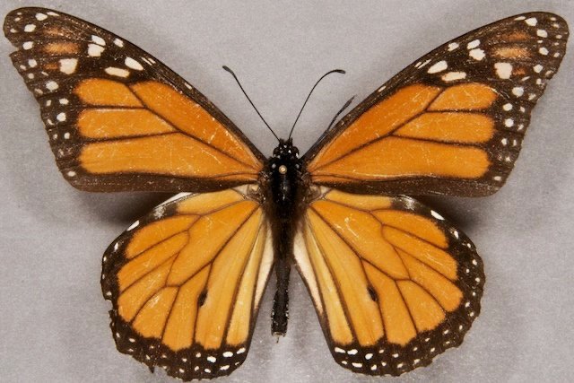
Entomologists pin butterflies to their specimen boards in a very unnatural pose where the front wings are stretched forward to reveal the details of the hind wings.
I wanted the wings to look natural and have very slight irregularities between the two sides, just like in a normal butterfly. After sketching the butterflies as they appeared in the reference images, I cut each of the outlines down the middle along the line of the abdomen and then flipped a copy over to create a mirror image This allowed me to pick the side that seemed more like what I wanted then just flattened the file and printed them as the new reference. I created outlines of these sketches and transferred them to my watercolor paper.
Next, during the painting process, my inability to exactly recreate the details on each side of the butterfly would create the natural variety you find in the actual patterns and colors in the real world samples. In the end, the butterflies had very similarly patterned wings but had natural variations that kept them looking relatively believable.
Which ones to paint?
This one was a bit easier; basically, I just picked the most common butterflies along with the ones I have a natural affinity for. I have always loved the smaller species like the Spring Azure and the Sara Orangetip so they definitely made the list. I then picked the ones that were representative of a common variety and were generally the most common example, e.g., the Clouded Sulphur, Satyr Comma, and Painted Lady. Lastly, there were the ones that were specific to Montana or at least characteristic, such as the Mormon Metalmark, Western White, Milbert’s Tortoiseshell, and the state butterfly, the Mourning Cloak. I filled in the others based on what I felt was missing. So basically it wasn't very scientific but relied on my artistic judgment.
I relied heavily on the wonderful Field Guide published by the state of Montana, that includes a list of all of the species of (not just) butterflies in Montana. If you have a few moments, I would highly recommend giving it a look: Montana Field Guide to Butterflies
Painting them the “correct” size
One cheat I employed for some of the smaller butterflies was to paint them at 200% of their actual size and then just resized them back down for the final illustration. This allowed me to incorporate more detail, have a better quality original image that I could use for other things (think stickers), as well as just being easier to paint. Sometimes the “correct” size is simply the size that suits the purpose.

All of these (except for the Mourning Cloak in the bottom left) were painted at 200%
How long did they take?
I set a limit of completing at least 3 butterflies each day to keep my time down. I started with a fineliner pen for the butterflies with dark or black details (Painted Lady, Viceroy, Monarch, Red Admiral, etc.) and then applied the color washes and details with watercolor afterwards. I really love pen illustration so this project really helped rekindle my enjoyment of using a fine (0.1 and 0.05mm nibs) pen to create tiny dots and lines and then applying beautiful transparent washes over the top. Very satisfying.

All of the originals with only one failure. Can you spot it? Oops…
Once they were all painted, I scanned them into the computer, reduced the ones I had enlarged back to their original sizes, started arranging them into a pleasing pattern on the artboard and applied the text labels. Overall, I really like the way they present a weirdly organized arrangement of flittering, fluttering, flutterbies.
Where can I get a print?
The print is available by filling out a request form below, or you can pick up a copy at the River’s Mist Gallery in Stevensville, Montana or if you happen to be in Missoula, you can find my prints at The Artists Shop right on Higgins Ave.
The prints are sized for a 16” x 20” frame size (11” x 15” image size) and are printed on 100% cotton rag archival fine art paper with pigment-based inks and are available for $50 + $8 S&H (U.S. customers only).